Wednesday, 27 March 2013
Friday, 22 March 2013
CGAA/ACT Live Commission Speed Painting 1-2-3-4
Speed Paint Challenge 1

Speed Paint Challenge 2

Speed Paint Challenge 3

Speed Paint Challenge 4

Tuesday, 19 March 2013
Saturday, 16 March 2013
Unit4: Fantastic Voyage- Cell Designs
I have tried to create Atomic Age designs, using the visual references I have uploaded earlier, as abstract textures to apply to the cells.
Atomic designs concept

Cell concept using the Atomic design above.

Unit4: Fantastic Voyage- Style Update
Following my OGR feedback from Phil, He pointed out to the Atomic Age, which refers to the period 1940-1960 which is about the nuclear war which dominated Western society.
Architecture, industrial design, commercial design ( including advertising), interior design and fine arts were all influenced by the themes of atomic science. Atomic Age design became popular and instantly recognisable, with the use of atomic motifs and space age symbols. Retro-futurism is a current comeback of interest in Atomic Age design.
However, I wasn't quite sure about the environment as Phil said it shouldn't be very textural because it's putting off the other designs( Cell..).
New visual influences:


Wednesday, 13 March 2013
CGAA/ACT Live Commission Speed Painting 6-7-8
Speed paint challenge 6

Speed paint challenge 7

Speed paint challenge 8

Friday, 8 March 2013
Speed painting Practise
A few speed paintings I have done today to practise a little bit and relax, it was enjoyable.


Thursday, 7 March 2013
Wednesday, 6 March 2013
Unit4: Fantastic Voyage- Concept
A little concept of how I visualise the Eukaryotic cell in the environment, it shows the Vintage abstract look I am going for, I still want to improve the look of the cell and then start working on the inside of it.


Unit4: Fantastic Voyage- Interactive Quiz idea

Interactive/Interactivity: In computers, it's the dialog that happens between a human being and a computer program, which means, programs that run with the interaction of the user or his involvement.
The hypertexts that link you to other pages are the most common form of interactivity

Quiz: is a form of game or mind sport in which the participants should answer the questions correctly. In some countries, a Quiz is also a brief assessment used for education purposes to measure one's knowledge, skills/abilities.
My animation will be presented as an interactive Quiz format, which means the presenter will ask the students questions about the Eukaryotic cell cycle and give them answers to choose from, the participant will have the opportunity to choose the right answer by clicking on a small text/annotation linked to another video. If the participant gets the right answer, the animation will play and show the type of the cycle mentioned( for example, G1 or S-phase.. ) if not, the presenter will verbally correct the answer and let the animation play to show the right answer/cycle.
I will also have voiceover which will put the participant in a real TV Quiz competition "vibes"
This way, the animation will be very educational and more enjoyable.
After a talk with Tutor Phil, I got some very useful references for my Quiz idea, for instance the interactive concept (Singing Hedgehogs from Bird box Studio)
I found another useful reference:
Tuesday, 5 March 2013
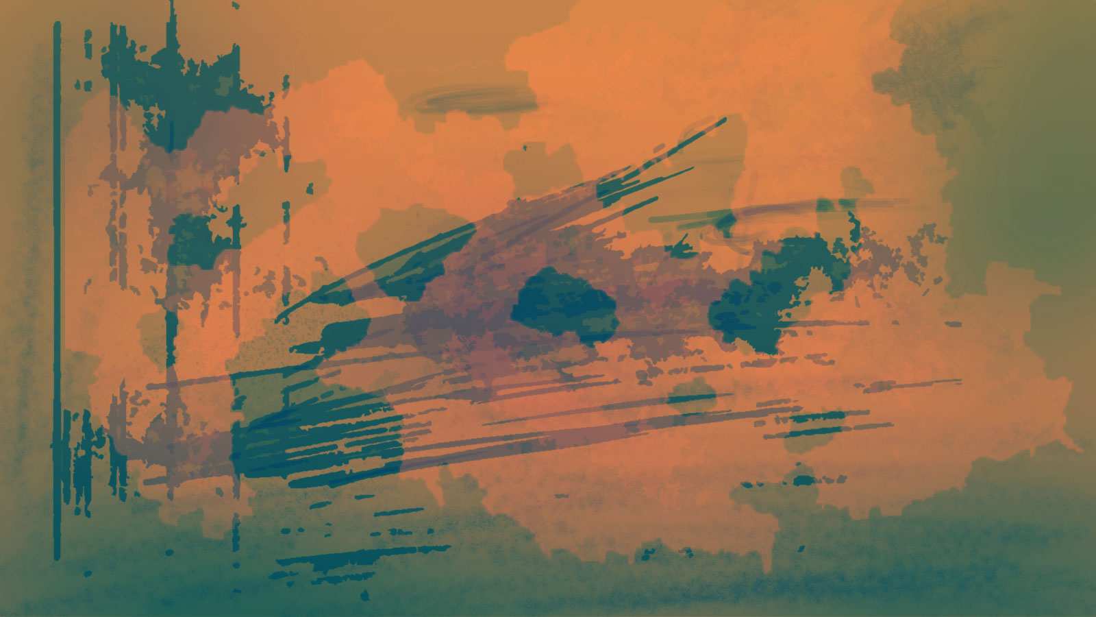
Unit4: Fantastic Voyage- Vintage Abstract Photography
Original pictures on the left and manipulated ones on the right.
This experiment shows vintage abstract photographs which I will be using as textures in my 3d Animation.


Unit4: CG Artists Toolkit- Lifedrawing week2
During this lesson we have started straight away with a 30min pose, long poses really defeat me
So I have decided to do many drawings of the same pose.

I enjoyed the rest of the lesson, as we had to draw the lines in an abstract form

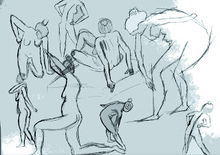
So I have decided to do many drawings of the same pose.


and respond to the poses in an expressionistic way.

Unit4: Fantastic Voyage- Abstract Photography Research

Concerning the style/textures for my animation, I am going for Retro/Vintage abstract art style. I thought about experimenting with abstract photographs and manipulating them on Photoshop using different filters to give them this retro/vintage look/feel.
But before starting the experiment, I have done a research about abstract photography, its purpose, techniques and its composition.
Abstract photography is defined as photography that:
doesn't represent the subject in a literal way, communicates primarily through form, color and curve rather than the image detail.
Abstract photography communicates to the viewer primarily through his emotions and this is an advantage for the abstract form as the human emotional system is much more powerful than his logical system.
In addition to that, there is a very strong reaction from the human perceptual system to colors, forms and curves, it is not only psychological but also wired to the human neurological and mental system as the human visual system responds very strongly to some colors, curves and shapes as well.
On further research, I have noticed that did not have to be unrecognizable.
There are 3 essentials to abstract photography:
Form: This means the shape of the objects, choosing objects that have interesting, dynamic and pleasing shapes is crucial. We must remember that abstract photography is an instinctual art form to which people respond emotionally and not logically, this means it is necessary to find objects with forms that create emotional reactions.
Colour: The colour play a very important role in terms of grabbing the viewer's attention as well as stimulating the viewer's perceptual system. There are many ways of using colors to produce dynamic images, for instance using contrasting colours.
Curves/ Center of interest: Curves help by controlling the viewer's eyes through an image and direct the viewer's eyes to the point of interest. Even if there's no center of interest. the curves are helpful and effective in terms of attracting the viewer's attention.
Concerning the composition of the picture, we can choose to follow the rule of thirds in which the point of interest should be located where the dividing lines cross or we can ignore the rule.
Monday, 4 March 2013
Unit4: Fantastic Voyage- Initial thumbnails
Just a few abstract thumbnails using the vintage colour palette for the second speed paint.


Unit4: Fantastic Voyage- Style
Concerning
the style of my animation, I want to give it some sort of
Retro/Vintage abstract art
look
because of the energy it communicates.
Abstract
art

began
with the work of three artists who didn't know each other but
produced abstract works almost at the same time.
Wassily
Kandinsky, Piet Mondrian and Kasimir Malevich.
Abstract
art features forms that do not represent the outside world. When the
three painters discovered abstraction, they considered it as a
personal, philosophical and emotional approach.
Retro
Art Vs. Vintage Art
The
two terms are often interchanged in modern language; however there
are some distinct and important differences between them. Here we
will wade through the confusion and hopefully enlighten you with the
proper usage of each term.
Let's
start with the term retro.
Retro
derives from the Latin meaning "backwards" or "in past
times". The definition of retro that is most closely associated
with past trends of art and fashion derives from the French term
retrospectif, which was abbreviated to simply retro. The term retro
became popular in the 1970's to describe French fashion, and was used
in French novels and film. The word retro, shortly thereafter made
its way across to America and into American fashion and culture.
Retro
Art refers to art that just a little bit quirky. Think kitsch,
theatrical and eccentric. Retro is also something that is a bit more
modern than something that is defined as vintage. Retro focuses on
items dated between roughly the 1950's to the 1980's
Vintage
Art
Vintage
is taken from the world of winemaking and refers to the year in which
the wine was "laid down" or put into wooden casks. What you
should take from this origin is vintage art and overall vintage items
should be associated with a specific year.
Vintage
focuses on time periods of the early 1900's until roughly the 1940's.
The
recurring elements in the vintage style:


Background
and “paper effect” graphics : in
the 50s-60s the great age
of plastics had
not yet begun; shopping bags were of fabrics (raw cotton, mainly),
the packaging of the products in cardboard, and so on. Thus, the
paper played a fundamental role and just because of that the “paper”
effect – especially if aged, turned yellow, worn off because of
time and use – is one of the main graphic effects which recur in
the vintage style. The same holds for old postcards, stamps,
newspapers, pictures in black&white or the cuttlefish effect, on
condition that they have an experienced aspect.

Magazine
style and newspapers of the age: another
graphic style vastly used in webdesign is based on the aesthetics of
old newspapers, almost always in black and white or “turned yellow
by time”, combined with a retro typography.

Calligraphic
fonts or old style fonts: the
major part of vintage/retro design makes use of a typography based on
calligraphic fonts, which give a more realistic and informal imprint
compared to modern fonts and “old style” fonts, which with
difficulty can be integrated in other styles of design.

Colors: The
colors of the vintage style tend to recall the tonalities of paper
and cardboard: beige,
brown, cream,
maybe not in plain pigment but under the form of textures and
patterns. In addition the red,
the dark
green and
theblue are
used a lot. For who prefers a more dated and classic one, it is
advisable to limit oneself to black/white with
a hint of grey.
Broadly speaking the vintage style has opaque colors, “consumed”
(a bit like for the grunge): opposed to the retro effect (which is
famous for the style pop-art design and the brilliant colors) in this
style therefore bright colors should be avoided, limiting them to
some details which have to attract the attention of the user.

Visual
references:
The
thomas Beale Cipher Animation: An award winning animation in which
the retro/vintage textures and look is used throughout the animation
as well as the use of silhouette, this mix makes the animation very
eye catching and communicates very strong emotions.
Influence Images:


Subscribe to:
Posts (Atom)